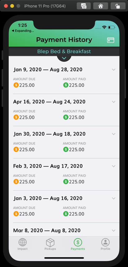
While building the app for Eco-Soap Bank, we received input from a third party on our app that led us to create expanding collection view cells to display payment information. After the other team members had constructed the cell and view controller, I stepped in to lend a hand with animating the cell’s size as well as the disclosure indicator. The resulting animation looks like this:
I realized that while fairly simple to accomplish once you know what you are doing, it can be a little tricky to figure out how to set this up for the first time. The setup is also slightly different if you are using a flow layout vs. compositional layout, or traditional data source vs. diffable data source. The Eco-Soap Bank app happens to use a compositional layout with a traditional data source.
Walkthrough
I created an example project repo that demonstrates how to create the expanding effect, no matter your setup. The main branch uses a compositional layout and diffable data source (which I prefer), while there is another branch that uses a flow layout and traditional data source. Let’s first take a look at how to set it up with a compositional layout and diffable data source.
Setting up the cell
When setting up the constraints, I created properties for constraints that would define the height of the cell when both opened and closed, this way they could later be activated and deactivated in order to change the cell’s size:
private var closedConstraint: NSLayoutConstraint?
private var openConstraint: NSLayoutConstraint?
Then I took care setting up my constraints so that they properly defined the height of the cell. To make sure the content stayed pinned to the top as the cell expands and contracts, I set the priority of the bottom constraints to .defaultLow:
NSLayoutConstraint.activate([
    contentView.topAnchor.constraint(equalTo: topAnchor),
    contentView.leadingAnchor.constraint(equalTo: leadingAnchor),
    contentView.trailingAnchor.constraint(equalTo: trailingAnchor),
    contentView.bottomAnchor.constraint(equalTo: bottomAnchor),
    rootStack.topAnchor.constraint(equalTo: contentView.topAnchor, constant: padding),
    rootStack.leadingAnchor.constraint(equalTo: contentView.leadingAnchor, constant: padding),
    rootStack.trailingAnchor.constraint(equalTo: contentView.trailingAnchor, constant: -padding),
])

// We need constraints that define the height of the cell when closed and when open
// to allow for animating between the two states.
closedConstraint =
    nameLabel.bottomAnchor.constraint(equalTo: contentView.bottomAnchor, constant: -padding)
closedConstraint?.priority = .defaultLow // use low priority so stack stays pinned to top of cell

openConstraint =
    favoriteMovieLabel.bottomAnchor.constraint(equalTo: contentView.bottomAnchor, constant: -padding)
openConstraint?.priority = .defaultLow
I also made sure to set translatesAutoresizingMasksIntoConstraints to false:
contentView.translatesAutoresizingMaskIntoConstraints = false
rootStack.translatesAutoresizingMaskIntoConstraints = false
In order to modify the cell’s appearance when it is selected or deselected, I used a didSet on the isSelected property of the cell to call an update method:
override var isSelected: Bool { didSet { updateAppearance() } }
In the update method, I modify the properties I would like to change. I found that constraints are properly animated in combination with the technique I used in the collection view delegate. However, other things such as transform must be explicitly animated in order to properly animate in all circumstances:
/// Updates the views to reflect changes in selection
private func updateAppearance() {
    closedConstraint?.isActive = !isSelected
    openConstraint?.isActive = isSelected

    UIView.animate(withDuration: 0.3) { // 0.3 seconds matches collection view animation
        // Set the rotation just under 180º so that it rotates back the same way
        let upsideDown = CGAffineTransform(rotationAngle: .pi * 0.999 )
        self.disclosureIndicator.transform = self.isSelected ? upsideDown :.identity
    }
}
Setting up the View Controller
When creating a UICollectionViewCompositionalLayout, you need to use an estimated dimension for any dimensions that you want to be defined by the cell. And rather than just using an estimated dimension in the group and making the item fill the group with fractional dimensions, you need to use this estimated size in both the item and the group. An easy way to do this is to use one size for both of them:
// The item and group will share this size to allow for automatic sizing of the cell's height
let itemSize = NSCollectionLayoutSize(widthDimension: .fractionalWidth(1.0),
                                     heightDimension: .estimated(50))

let item = NSCollectionLayoutItem(layoutSize: itemSize)

let group = NSCollectionLayoutGroup.horizontal(layoutSize: itemSize,
                                                 subitems: [item])
So by setting the height to an estimated value of 50 points, I am allowing it to grow or shrink as defined by the collection view cell’s layout constraints. The other option for defining the cell’s size would be to override sizeThatFits in the collection view cell, which I have done in the past. That method is a little more complicated though, so I won’t go over it right now.
Since I wanted the collection view to support deselecting the currently selected cell, I implemented shouldSelectItemAt instead of didSelectItemAt in the delegate. Then in this method, I manually select or deselect the cell. After doing so, I also refresh the data source by reapplying the current snapshot. I made an extension on UICollectionViewDiffableDataSource that performs this operation in a new function called refresh.
extension PeopleViewController: UICollectionViewDelegate {
    func collectionView(_ collectionView: UICollectionView,
                        shouldSelectItemAt indexPath: IndexPath) -> Bool {
        guard let dataSource = dataSource else { return false }

        // Allows for closing an already open cell
        if collectionView.indexPathsForSelectedItems?.contains(indexPath) ?? false {
            collectionView.deselectItem(at: indexPath, animated: true)
        } else {
            collectionView.selectItem(at: indexPath, animated: true, scrollPosition: [])
        }

        dataSource.refresh()

        return false // The selecting or deselecting is already performed above
    }
}

extension UICollectionViewDiffableDataSource {
    /// Reapplies the current snapshot to the data source, animating the differences.
    /// - Parameters:
    ///   - completion: A closure to be called on completion of reapplying the snapshot.
    func refresh(completion: (() -> Void)? = nil) {
        self.apply(self.snapshot(), animatingDifferences: true, completion: completion)
    }
}
Difference for Traditional Data Source
If you happen to be using a traditional data source instead of a diffable one, there is really only one difference. Instead of reapplying the current snapshot to the data source, you can simply call performBatchUpdates with nil as so:
func collectionView(_ collectionView: UICollectionView,
                    shouldSelectItemAt indexPath: IndexPath) -> Bool {

    // Allows for closing an already open cell
    if collectionView.indexPathsForSelectedItems?.contains(indexPath) ?? false {
        collectionView.deselectItem(at: indexPath, animated: true)
    } else {
        collectionView.selectItem(at: indexPath, animated: true, scrollPosition: [])
    }

    collectionView.performBatchUpdates(nil)

    return false // The selecting or deselecting is already performed above
}
Differences for Flow Layout
Using a flow layout introduces a few more differences. In the flow layout itself, you will want to set the estimated item size:
flowLayout.estimatedItemSize = UICollectionViewFlowLayout.automaticSize
flowLayout.minimumLineSpacing = padding
Since this then expects that we will be fully defining the cell’s width as well as height, we need a way to make our cells take up the available width of the collection view. So in addition to the constraint properties I showed you above for defining the cell’s height, add another one for the width:
private var widthConstraint: NSLayoutConstraint?
I set this constraint up along with the others, giving it a priority of .required and a placeholder constant of 100.
widthConstraint = contentView.widthAnchor.constraint(equalToConstant: 100)
        widthConstraint?.priority = .required
Then I used a variable to allow the collection view to later set the width:
var width: CGFloat? {
    didSet {
        guard let width = width else { return }
        widthConstraint?.constant = width
        widthConstraint?.isActive = true
    }
}
As you can see, when this width is set, it activates the widthConstraint and sets the constant. So all that’s left to do is to pass in this width in cellForItemAt:
func collectionView(_ collectionView: UICollectionView, cellForItemAt indexPath: IndexPath) -> UICollectionViewCell {
    guard let cell = collectionView.dequeueReusableCell(
        withReuseIdentifier: String(describing: PersonCell.self),
        for: indexPath) as? PersonCell else {
            fatalError("Could not cast cell as \(PersonCell.self)")
    }
    cell.person = people[indexPath.item]
    cell.width = collectionView.bounds.width - padding * 2
    return cell
}
I subtracted the padding * 2 to give the cell equal padding on the sides as in-between cells vertically.
Wrap Up
As you can see, it’s not too hard to create self-sizing cells with a collection view, and then to animate them upon selection. I hope this helps you create your own dynamic animating collection views, and if it does, hit me up on twitter @swift_student, I’d love to see what you create!