Recently while working on a project, I stumbled across something that at first glance seemed like it was super simple and would be as easy as setting a property or two. I decided that I wanted a button in my app to emulate the look of Apple’s buy and update buttons in the app store, which look something like this:

It appears as though they are simply animating the background color as well as the font color of the button. Simple, right? But when I went to do it, I realized there is no option in the storyboard to set the background color of a button for a particular state. And in code, there is no setBackgroundColor(_ color: UIColor?, for state: UIControl.State).
Most of the popular solutions I saw to this problem involved creating a UIImage that is a solid color, as there is a property for setting the background image. This seemed rather convoluted to me, so I thought about how else this simple problem could be solved. After using target action, which worked but was less than ideal for re-use, and then playing with subclassing UIButton and getting the touches directly, I realized a simple solution existed. All I had to do was observe the UIControl property isHighlighted and modify my button accordingly.
I started by subclassing UIButton, and adding some properties for a normal background color and a highlighted background color:
@IBDesignable
class HighlightButton: UIButton {

    @IBInspectable var normalBackgroundColor: UIColor? {
        didSet {
            backgroundColor = normalBackgroundColor
        }
    }

    @IBInspectable var highlightedBackgroundColor: UIColor?
Notice that I also marked this subclass @IBDesignable and made these properties @IBInspectable. This is handy for working with storyboards and allows us to see what our button will look like in real time.
Since the button I was trying to emulate also has rounded corners, I decided to add a cornerRadius property. As a shortcut for making a pill shape, I decided to set the layer’s corner radius to half of the frame’s height if this property was set to anything less than 0:
@IBInspectable var cornerRadius: CGFloat = 0 {
    didSet {
        if cornerRadius < 0 {
            layer.cornerRadius = frame.height / 2
        } else {
            layer.cornerRadius = cornerRadius
        }
    }
}
Next I needed to set up my observer for isHighlighted. A big takeaway for me from this little experiment is that you can simply override a property and put a didSet on it to observe changes. In this didSet I only wanted to animate changes when the state was changing, so I checked the oldValue vs. isHighlighted:
override var isHighlighted: Bool {
    didSet {
        if oldValue == false && isHighlighted {
            highlight()
        } else if oldValue == true && !isHighlighted {
            unHighlight()
        }
    }
}

func highlight() {
    // Animate changes for highlighting
}

func unHighlight() {
    // Animate changes for un-highlighting
}
To make animating the background simple, I added a property for the animation duration:
var highlightDuration: TimeInterval = 0.25
Then I created a simple helper function to do the animating:
private func animateBackground(to color: UIColor?, duration: TimeInterval) {
    guard let color = color else { return }
    UIView.animate(withDuration: highlightDuration) {
        self.backgroundColor = color
    }
}
Back in the highlight() and unHighlight(), I simply called this function with the appropriate color and duration:
func highlight() {
    animateBackground(to: highlightedBackgroundColor, duration: highlightDuration)
}

func unHighlight() {
    animateBackground(to: normalBackgroundColor, duration: highlightDuration)
}
Now my button was all ready to use! Here is what my interface looked like in storyboard:
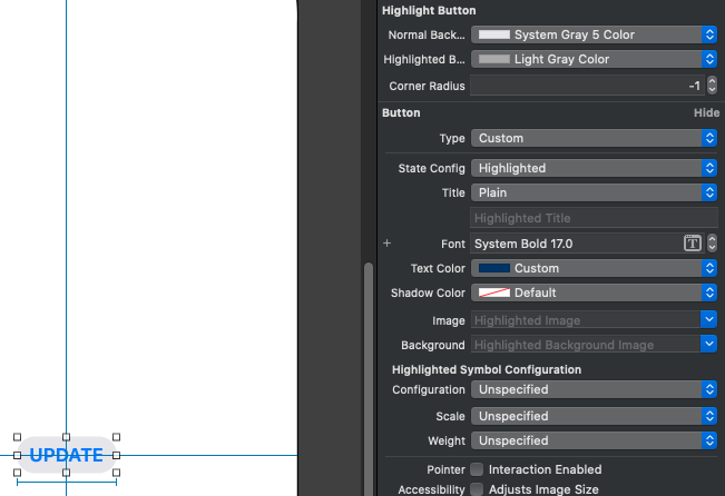
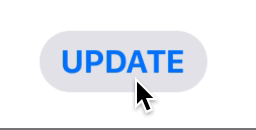
Note that I did still use the state configuration to set the title color for the highlighted state in the normal manner. While I didn’t spend too much time tweaking the parameters to match Apple’s exactly, here is what my HighlightButton looks like in action:
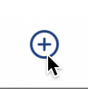
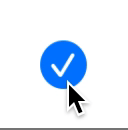
From here, I decided to see what other Apple buttons I could find that would be interesting to emulate. I happened upon this follow button in the News app:
While it may seem like you could just set the image for the selected state, unfortunately the default behavior for when the images switch when tapping while in the selected state doesn’t match Apple’s design here in the News app. Also, we need a mechanism for animating the scale. I decide to subclass my HighlightButton to make a ToggleButton:
IBDesignable
class ToggleButton: HighlightButton {

    @IBInspectable var highlightedScale: CGFloat = 1
    @IBInspectable var normalImage: UIImage?
    @IBInspectable var selectedImage: UIImage?

    var scaleDownDuration: TimeInterval = 0.05
    var scaleUpDuration: TimeInterval = 0.25
So to start with I’ve got inspectable properties for the scale and both images, and some durations that I’ve set up to be similar to Apple’s animation.
Then I override highlight() and unHighlight() to add a scaling animation, toggle isSelected (eliminating the need to do this in my code elsewhere), and swap the images:
override func highlight() {
    super.highlight()
    animateScale(to: highlightedScale, duration: scaleDownDuration)
}

override func unHighlight() {
    super.unHighlight()
    animateScale(to: 1, duration: scaleUpDuration)
    isSelected.toggle()
    swapImages()
}
For the animation, I used a spring animation as I noticed Apple’s had a little bounce at the end:
private func animateScale(to scale: CGFloat, duration: TimeInterval) {
    UIView.animate(
        withDuration:
        duration,
        delay: 0,
        usingSpringWithDamping: 0.5,
        initialSpringVelocity: 0.5,
        options: [],
        animations: {
           self.transform = .init(scaleX: scale, y: scale)
        }, completion: nil
    )
}
And finally, a simple function for swapping images:
private func swapImages() {
    guard let selectedImage = selectedImage else { return }
    setImage(isSelected ? selectedImage : normalImage, for: .normal)
}
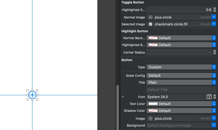
Here is what this button looks like in the storyboard:
And finally in action:
I hope this inspires you to create some custom buttons of your own with different animations! If you do, let me know, I would love to see them :D